Monday, September 27, 2010

Charles Lebrun master copy


One of my favorite drawings by Charles Lebrun. This was done using Prismacolor terra cotta Verithin pencil on Daler Rowney Ingres buff paper sized with amber shellac (1 part shellac to 5 parts denatured alcohol).

standing female back view


This was done using Prismacolor black Verithin pencil on white Hahnemuhle Ingres toned with raw umber watercolor and extra sizing added (1 part amber shellac to 5 parts denatured alcohol).

male swinging position back


This was done using Prismacolor black Verithin pencil on Lanaquarelle watercolor paper toned with raw umber and extra sizing (1 part amber shellac to 5 parts denatured alcohol).

Tuesday, September 14, 2010

female portrait study


This was a portrait study done with terra cotta Prismacolor Verithin pencil on rose colored Hahnemuhle Ingres paper.

Friday, September 10, 2010

male study standing leaning on column


This was done using black Prismacolor Verithin pencil on Lanaquarelle watercolor paper toned with a yellow ochre wash and after dry, an extra coat of sizing (part 1 amber shellac to part 5 water) was put on.

Wednesday, September 8, 2010

male study seated and reaching for skull


This was a 5 hour study using black Prismacolor Verithin pencil on Lanaquarelle watercolor paper with a wash of yellow ochre watercolor and after drying a wash of part 1-to-5 amber shellac to denatured alcohol to give extra sizing to the paper.

male study standing and reaching down


This was a 3 hour study using black Prismacolor Verithin pencil on Lanaquarelle watercolor paper with a wash of yellow ochre watercolor and after drying a wash of part 1-to-5 amber shellac to denatured alcohol to give extra sizing to the paper.

Thursday, September 2, 2010

male study looking down at flower


This is a 3 hour study on Lanaquarelle watercolor paper treated with a wash of raw ochre watercolor and after having dried, with a wash of one part amber shellac to 5 parts denatured alcohol.

Robert Liberace's workshop

Well what is there to say about Robert Liberace other than he is one of the finest artists and teachers today. I was blessed to have a workshop from him and drank in as much as I could. Here is the result. The works were done on Lanaquarelle watercolor paper with a wash of yellow ocre and then some extra sizing put on after that. The sizing was one part amber shellac to five parts denatured alcohol. This isn't the paper Rob uses, but it is what I had laying around. He uses Twinrocker calligraphy cream. That paper is laid, like the various Ingres papers and it is also very hard. The wash treatments are what he does. The reason for the extra sizing is to make the paper even harder still. The drawings were done with Prismacolor Verithin colored pencils using colors terra cota and black. For highlights, you could erase out some of the wash. It created an affect very much like the old masters of past when they used red and black chalks. For the future, I'm going to be using the harder laid papers like Rob did as I found the watercolor paper to have too much padding and thus the colored pencils tended to sink into the paper too much. Rob used a text weight paper so there was no cushion. The thin paper coupled with so much sizing created a very hard surface so as to abrade the colored pencils, which created that beautiful frayed look the old masters had in their drawings. And the Verithin pencils had such a sharp point that you could get those delicate thin lines. These were all about 3 hour studies.


Tuesday, August 17, 2010

reclining female


This was a 3 hour study using dark sepia Cretacolor on Magnani Arturo sand colored paper.

seated female


This was a 9 hour study using sanguine Cretacolor on Magnani Arturo sand colored paper.

reclining female nude


This was a 3 hour pose using sanguine Cretacolor on light green Hahnemuhle Ingres paper.

Greenlake park


Another Greenlake Park study. This is dark sepia and white chalk Cretacolor on a green colored Fabriano Ingres paper.

Tuesday, August 3, 2010

Greenlake park


This was a 3 hour sketch at Greenlake park in Seattle. I used Cretacolor dark sepia on a light green Fabriano Ingres paper.

seated male holding ball


This was a 3 hour study using Cretacolor dark sepia on light gray-green Hahnemule Ingres paper.

seated female


This was a 9 hour study using Cretacolor dark sepia on gray Strathmore Ingres paper.

seated female


This was a 3 hour study using Cretacolor light sepia on a light, grey green Hahnemule Ingres paper.

Monday, July 19, 2010

river


Another sketch of the river by my home. This was light sepia Cretacolor pencil on Fabriano Ingres paper that was a sage green color.

Saturday, July 17, 2010

reclining female nude


This was a 9 hour study using Cretacolor black and white chalk on Zerkall Ingres sand colored paper.

Monday, July 5, 2010

the river


This was a quick sketch of a river near my home using light sepia Cretacolor pencil on etching paper lightly toned with walnut ink.

Friday, July 2, 2010

seated male


This was a 51 hour study using Grumbacher hard vine charcoal on Zerkall Ingres tan paper.

female seated study


This was a three day study done with Grumbacher hard vine charcoal on Zerkall Ingres tan paper.

Tuesday, June 29, 2010

landscape sketch


A quick sketch of my driveway done with light sepia Cretacolor on etching paper lightly toned with walnut ink.

standing pose


This was a 3 hour study done with light sepia Cretacolor pencil on tan Zerkall Ingres paper.

Friday, June 18, 2010

female seated 9 hour study


This was a 9 hour pose done in vine charcoal and white pastel pencil on Zerkall Ingres tan colored charcoal paper.

Tuesday, May 25, 2010

female nude


This was done on Zerkall Ingres sand colored charcoal paper with vine charcoal and Pitt white pastel pencil.

master copy


This is a master copy after Annibale Carracci. This was black white chalk on tan heavyweight Rives BFK toned with burnt umber watercolor.

Monday, April 26, 2010

male study


This was done in red pastel pencil on light green Hanemuhle Ingres paper.

Friday, April 16, 2010

master copies


Master copies are an excellent way to learn mark making and line quality. These are drawings from Annibale Carracci. He was an absolute master of very sensitive figure drawings made with red chalk (as these were) and black chalk. I love the open line work and found when copying them that they sometimes followed the individual muscular forms and sometimes just went straight across multiple forms. The latter seemed to be used to create a particular value across a broad area. As a general rule it seemed the lines were delicate and sensitive always, even when they became a little thicker and darker. For both of these studies I prepared Rives BFK white paper with a wash of burnt umber water color and drew with cretacolor sanguine lead.

Sunday, April 4, 2010

reclining male nude


This drawing is done in vine charcoal on Zerkall Ingres Sand colored paper. This was about a 15 session pose with each session taking 3 hours.

Friday, April 2, 2010

female nude


This is a figure drawing I finished this afternoon. It is vine charcoal on Zerkall Ingres, Sand colored paper. This was a 17 session pose and each session was 3 hours. In the last session I worked real hard on the face to attempt a reasonable likeness and bring it to a finish on par with the rest of the figure. It's amazing how hard it is to really get a likeness. And it is doubly hard to really capture the character of a person.

Sunday, March 21, 2010

figure drawing using broader marks


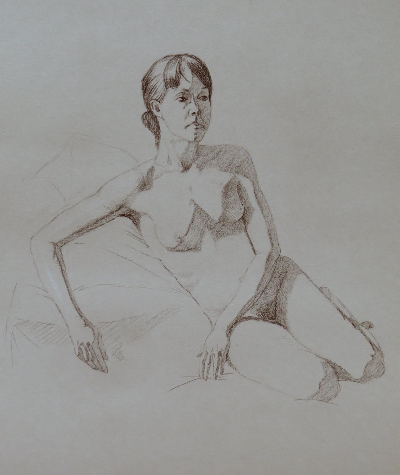
I just love studying the marks of the old masters when they used red or black chalk on a prepared surface heightened with white chalk. It will take me the rest of my life I'm sure to capture the finesse of the lines, their weight, suppleness and direction. This is a 3 session (3 hours each) drawing where I used Rives BFK white paper toned with a wash of burnt umber water color and light sanguine Creta color lead and white Creta color lead. This application is perfect for a faster study. The masters were absolutely genius at these types of drawings. Their contours and lines massing in the form were so sensitive and sensuous that many artists (like me) spend many more hours studying the drawings than the time spent on the paintings for which the drawings were a study.

Friday, March 19, 2010

Squiddly and Diddly


This is a cast drawing in graphite on Lanaquarelle hard pressed watercolor paper. A cast drawing is an exercise in learning how to render very convincingly so the forms turn beautifully. Most classical atelier students do at least one of these projects. This one took me about 3 1/2 months. I think the original sculpture I chose was of the Three Graces, which is a fairly common subject in art. But one of my graces broke off. So there was just the two of them and I named them Squiddly and Diddly. You get pretty attached after spending so long with them. If you should venture to take on one of these projects, it is a long time with tiny, little strokes, especially when doing the background which takes hours and hours. You may start dreaming in gray. And my arm developed a peculiar knot where a muscle got tweaked out. But it went back to normal after a while.

Thursday, March 18, 2010

figure drawings

Figure drawing is the meat and potatoes if one wishes to learn how to do figurative paintings. I absolutely adore figure drawing. These are in graphite as it is a little easier to control. But rendering in graphite takes an enormous amount of time. The paper I used is Strathmore smooth (first), Canson drawing paper (second) and Lanaquarelle (last two). I really like the Lanaquarelle but you really have to work at getting a nice, smooth finish in the rendering.


Wednesday, March 17, 2010

block-in practice

One can never do enough block-ins. It's funny, prior to having joined the Georgetown Atelier I never heard of the term block-ins. I'd have just called them drawings. But alas, the block-in is really a different creature. It's the scaffolding upon which a drawing will go. Much like the blue print for a building, only here you construct the drawing right upon it. So there are faint construction lines and directional lines and tiny angular lines and sketched in fuzzy core shadow lines and even a light tone washed upon the dark side. I being in love with contour can seldom resist to resolve my block-in lines into a final, finessed contour. The ones below I left more block-in like.


Tuesday, March 16, 2010

a pair of pears

Here are a pair of pears that constitute my first two projects. They were both challenging from the rendering point of view. It takes time to really see all the subtle value changes in the form, especially in the lights. And it takes time to master the materials, both the drawing instruments and the paper being used. After a while you develop a tactile sense of how the drawing tool works upon the paper. You eventually feel how hard press to get the value you need. For graphite, I used different grades of pencils from 4H to 8B to help achieve the value I needed. The charcoal I used mostly hard and some medium sticks of high quality. I used the brand Nitram which is no longer being made as the fella in France that made it decided to retire. Bugger!


Graphite pear on Lanaquarelle hard pressed watercolor paper. The Lanaquarelle takes the graphite beautifully, but it has a bit of a patchy texture where some areas seem a bit denser than others. I'm guessing this has to do with the cotton in the paper and how it was made. As a result though it can take a while to get a pristine, smooth surface. There's a lot of filling in little white dots and pulling out dark blotches and ant poop (little black dots).


Vine charcoal pear on Zerkall Nideggen paper. This paper had a bit of a wavy texture like what you'd see in the sand after the waves pull back. It made it a bit of a challenge if your goal was to completely overcome this texture leaving a smooth surface. The paper has a light, warmish tone almost like oatmeal of about a value 3. So I used a Pitt white pastel pencil to get the lights. The white pastel needed to be brushed out a bit with a fine paint brush spreading it toward the graphite until there was a seamless, smooth transition of value of light to dark.

Thursday, February 4, 2010

art school - i'm loving it

After getting laid off hopefully for the last time from my job in March (2009) I made a huge change in what I do every day. I decided to attend classical art school. I joined an atelier (Georgetown Atelier) that has a three year program in classical art training. The first year is drawing, the second monochromatic painting and limited palette painting and the third year full color. The year is divided into three trimesters and so far, I've made it through the first successfully. I did two pears, one in graphite and another in vine charcoal. I think the charcoal pear was the hardest thing I'd done in art up to that point. Vine charcoal, fussy little buggers! You're basically squishing dust onto your paper from burnt sticks of wood. And you get the least bit feisty, it completely rebels and creates little black dots fondly called "ant poop" and skips around causing little white dots to go with the black ones. You have no choice but to calmly stroke the charcoal stick letting it take it's time depositing little lines which blend together eventually into a smooth tone. It is a great teacher in patience. I'm now about half way through the second trimester and I'm just now finishing my first graphite cast drawing. I chose a relief cast of what was once the 'three graces', although one broke off so now there are just two. I've named them Squiddly and Diddly. Come this Monday I shall start on a long term charcoal cast drawing. I'll be doing a bust of Caesar.